Transit Companion UI

Figma

UX/UI

After Effects

User Research

Mar ‘24 - Aug ‘24

This collaborative case study aimed to identify bottlenecks in Vancouver's public transit system and design an accessible product to improve daily commuting. My role involved analyzing survey and interview data, prototyping a user-friendly device interface on Figma, and producing a presentation video to showcase our findings. The product was designed to assist commuters by streamlining their transit experience, and feedback highlighted its potential for enhancing accessibility. This project strengthened my skills in UX design, data-driven decision-making, and collaborative problem-solving.

The pitch video that I created to aid with demostration purpose of our product, Compass+

Design Process

We received positive participation with 150+ responses from 5 interviewees and 16 survey takers. I created an affinity diagram to place similar responses together to understand user needs and wants. Insight statements were used to converge on 5 main areas of focus where we could design for maximize efficiency on public transport.

With the insight statements from the responses, the team decided to design a commuting companion that would allow the user’s dependency on phone while commuting. I designed the screen on Figma to provided the necessary information to the user while commuting that will be aided by the haptic feature to notify the users about the alerts.

For the video demonstration, I created the shapes and designs on illustrator and used After Effects to animate them to aid our pitch about the device.

Image of the themes discovered by the team

The organised collection of themes that we found from responses. Most of the repsponses were frustartion against the transit inaccuracies

Image of the trends and gaps found out by the team to finalise the problem

Since we could not fix the transit scheduling system, we focused on how to reduce frustartion caused by those inaccuracies

Image of Try-It-Yourself context and procedure undertaken by the team

We conducted Try-It-Yourself research to conclusively define the chokepoints in transit system and fins inspiration to handle them

Challenges

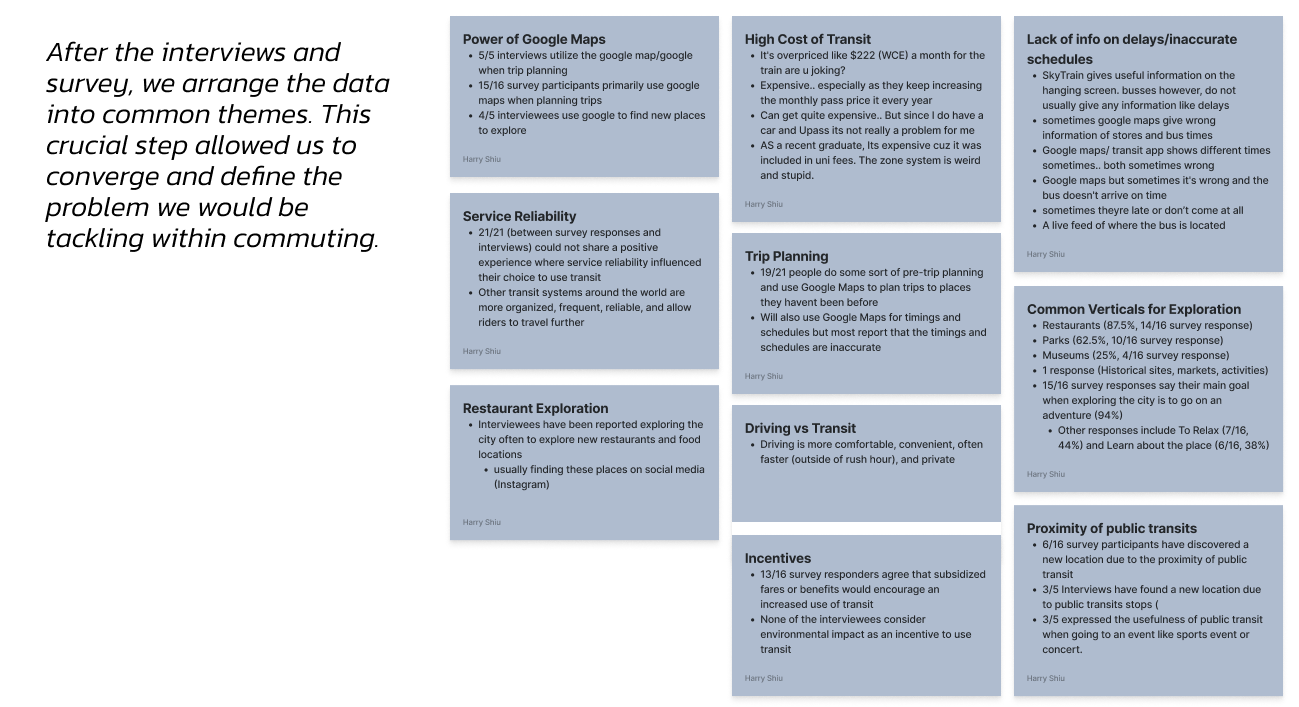
With 150+ responses, organization of data was crucial at comprehending the key values within responses. Fig Jam helped me to organize and create an affinity diagram that I could present to the team and explain my findings. It also helped me to remove duplicate values in my data.

As the final week of the project approached, it was a battle against time to polish the project. A detailed Gantt chart helped me balance prototyping the screens and creating the video for presentation. It also kept the team updated about my work.

Learning Outcomes

  • Develop a complex understanding for design framing and ideation process for success of a design project
  • Comprehending a complex set of information by creating affinity diagrams
  • Presenting the organized data to a team to facilitate design journey

Appendix: Pitch Deck

To pitch the idea of our product, we created a slides deck to help the client understand. This resulted in a quick grasping of the problems we are solving and the solution.

To pitch the idea of our product, we created a slides deck to help the client understand. This resulted in a quick grasping of the problems we are solving and the solution.

We designed an app that would help the user to communicate with their Compass+ and set navigation. Rather than competing with other navigation apps, our sole focus was on facilitating the user journey. Interacte with the prototype or head down to slide 14-18 on the slide deck for a video tour of the app.

Mail me maybe?