Financial Literacy App

Figma

UI Design

UX Design

User Research

Jul '24 - Aug '24

In this academic case study consisting of three designers, through primary and secondary research, we identified lack of financial awareness as a common problem faced by many young adults. We designed a financial literacy app with features that will allow the user to learn difficult concepts in small sections. I was responsible for the user research and conducting interview. I re-designed the UI of the original app after the end of the project.

My final iteration of the updated UI of the app

Design Process

For secondary research, the team added all the data on Figma from where we identified initial key elements. From the secondary research findings, I designed the interview questions relevant to the topic of interests which were modified to be added to a survey. The interviews were conducted by each designer and I was present as the notetaker.

The notes helped us create affinity diagram that helped us converge on a the problem of lacking financial literacy among the young adults. The app consists of two main features:

- Lessons that allow the user to learn complex topics by reading chuck sized information spread across different topics.

- Simulator that allows the user to apply their knowledge from lessons in various real-life simulators like Investment Portfolio, Budget Planner, Credit Score, etc.

We created a slide-deck to showcase our product to the audience. I re-designed the original UI of the app, integrating the feedback we received from the audience.

Final poster iteration for showcasing Isola Design Festival

Mock-up of the re-designed Simulator Feature page where users implement the knowledge they gained from lessons

Mock-up of the re-designed Lesson feature page where the user gets their information about topics

The affinity diagram that helped the group to segregate umbrella topics

Challenges

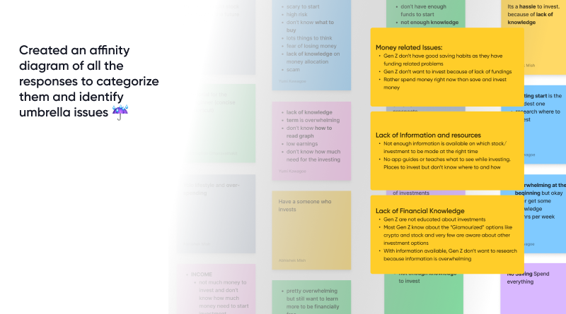
Converging on a particular problem was challenging as during the interview, the interviewees were presenting us with a wide variety of problems in the context of financial knowledge. The problem was streamlined when the data gathered was arranged in a affinity map under a boarder umbrella problems. This allowed us to explore various umbrella problems that our solution could incorporate.

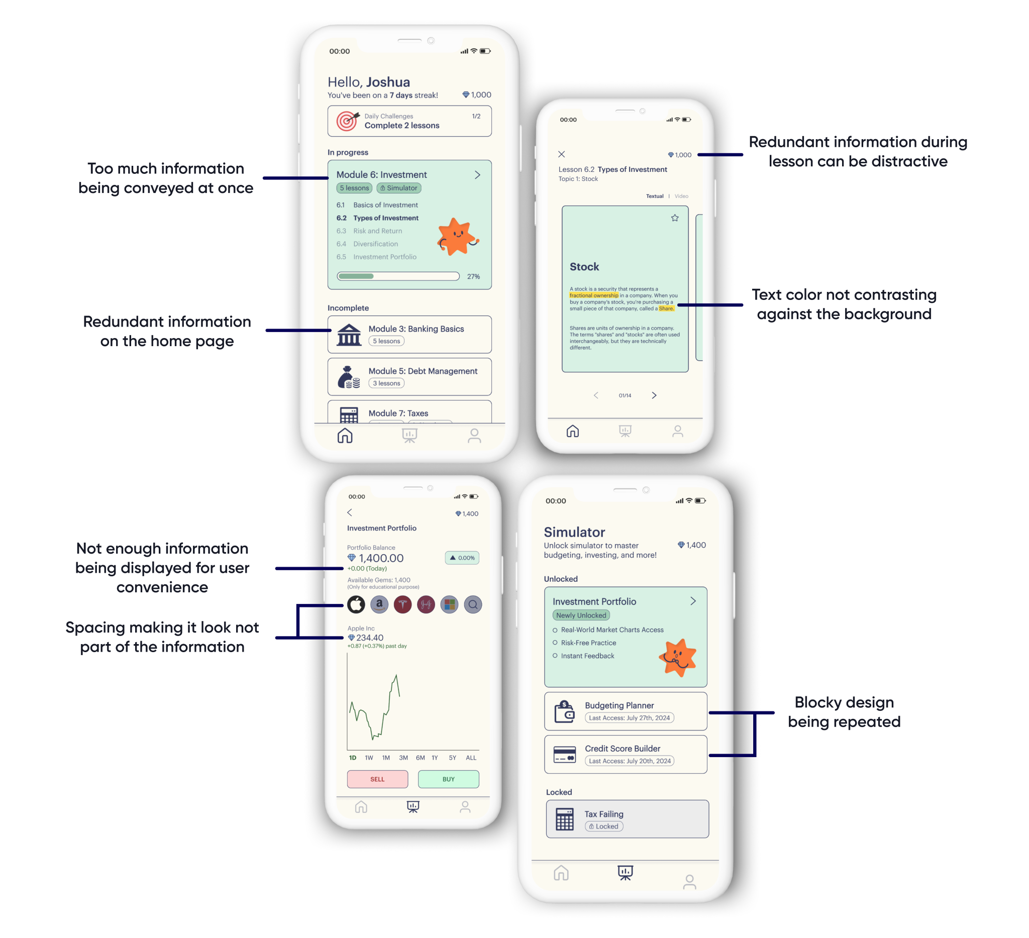
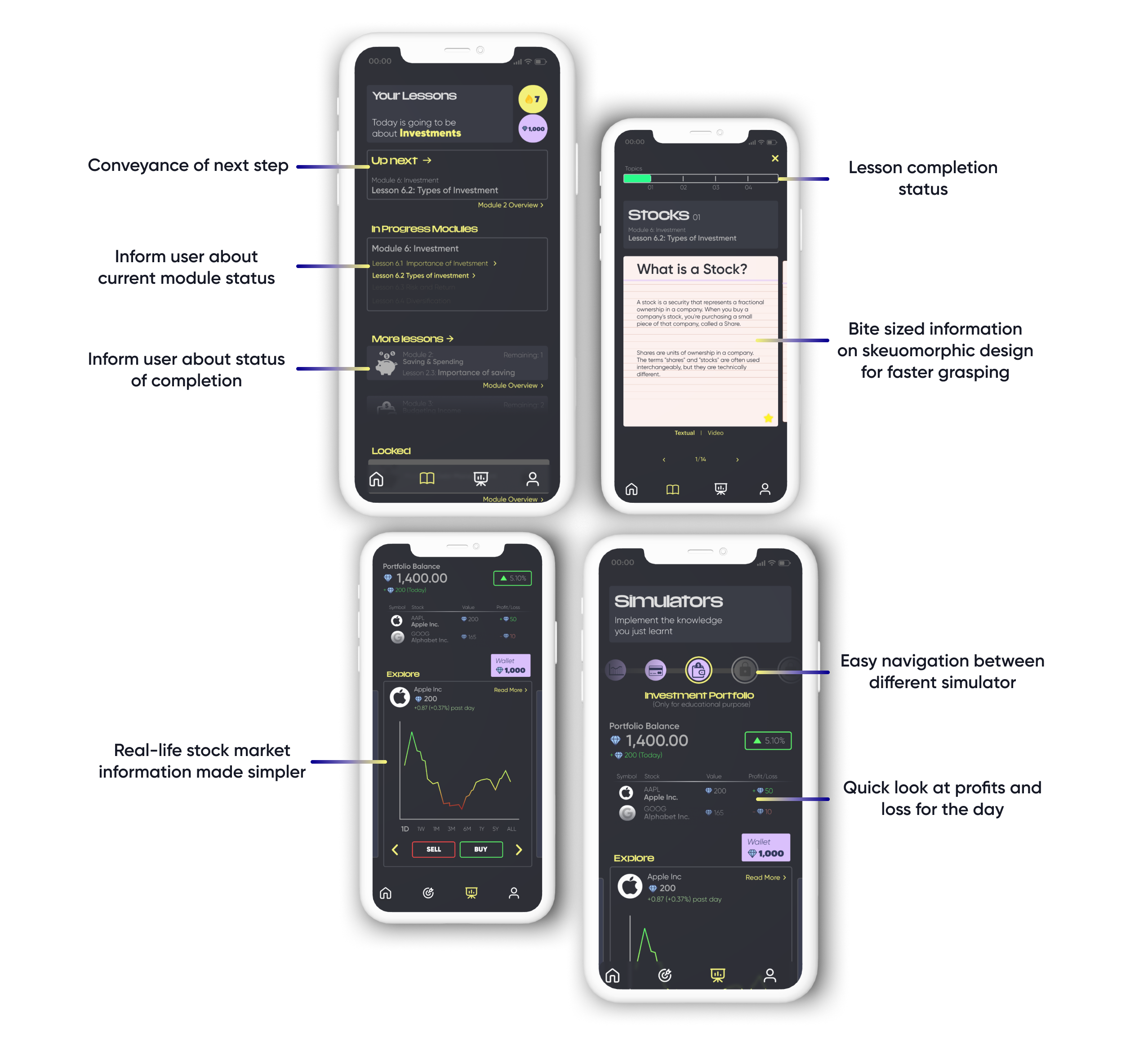
Re-designing the UI was challenging as identifying underlying problems in the current UI was difficult. The re-designing incorporated elements that would appeal more to young adults and also streamline the process of navigating.

Learning Outcomes

  • - Understanding and identifying problems in an already existing UI and solving those issues
  • - Develop a complex understanding for design framing and ideation process for success of a design project
  • - Comprehending a complex set of information by creating affinity diagrams

Appendix: Original UI Design

Poster pne shocasing a Ballet dancer to represnt one of the exhibition taking place in the festival about glass

The original UI was not catering to the target audience. The color palette consisted of one color and used different shades with no accent colors which created a very static look. Multiple redundancies of information made it difficult to navigate and allowed the user to easily get confused. The buttons were hard to identify as they were the same color as the background.

In my Iteration, I organized the information presented to the user based on importance. Since it is a learning app, the user should be focused on completing a particular task at hand before moving on to the next one. I also added accent colors that stood out to highlight relevant information.

Poster pne shocasing a Ballet dancer to represnt one of the exhibition taking place in the festival about glass

Mail me maybe?